My main image is of Sophie with a guitar in a violent manner I created this image in this way to show the emotion and violence of the music , this is also show thorough the blood that I added after the photo was taken using photoshop
Tuesday, 17 March 2015
Monday, 16 March 2015
music magazine double page spread
Main image :
My main image is of Sophie with a guitar in a violent manner I created this image in this way to show the emotion and violence of the music , this is also show thorough the blood that I added after the photo was taken using photoshop, i have linked my cover and contents page with the use of red and black as these colour can be commonly associated with alternative style as they are contrasting red is linked to violence and pain as well as love and black is linked to darkness and completely the opposite to white which would suggest a sinister look and feel to my magazine.
Sunday, 15 March 2015
Music Magazine Double page spread (CD cover)
this was my first idea for my CD cover for on my double page spread but i think that it looks strange and doesn't really work well and looks a bit normal as the album is called the freakshow.
so i decided to change it a bit to this , as i feel this works better:
so i decided to change it a bit to this , as i feel this works better:
Monday, 9 March 2015
double page spread process (main photo)
my first picture idea on my double page spread was :
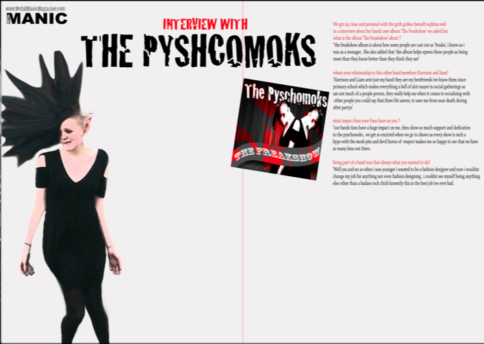
but i decided that it didn't partially go with my theme so i decided to change my photo in the end after looking through my pictures i made this :
i think this colour and style of my photo goses better with the theme of my magazine and colour scheme as its freaky and odd it also shows the rage and passion of the music style that is shown .
double page process (base layer)
firstly i decided to keep with the magazines colout scheme i used a light background with abstract colour to create an effect which will stand out but not too much just enough to be different in a unique way.
here is my base layer with base text:
here is my base layer with base text:
and then i added my additional text to fill space and make the page more even in proportion:
Subscribe to:
Comments (Atom)


